
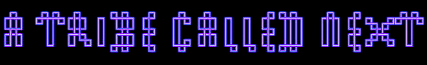


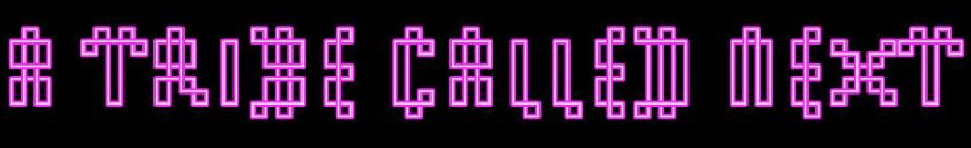
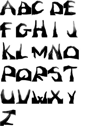
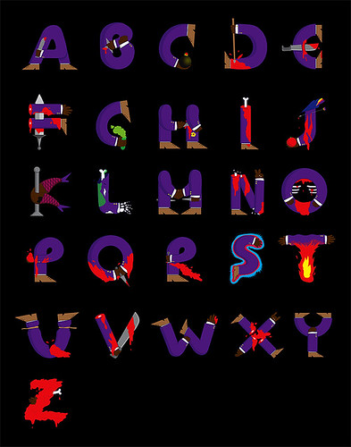
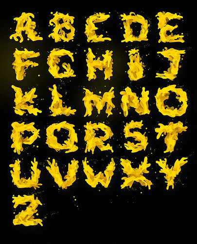
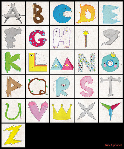
 Quite simply whats not to like? Put together two of my great loves, art and language, you get a third love of mine, the magnificent world of typography. Above is a random selection, by no means the most impressive or innovative, but still cool.
ps. Times New Roman, you'll always have a special place in my heart as you help me to read quickly in an efficient manner... You know he [Times] is blatantly good for novels and stuff. For everything else - the possibilities of visual communication via language and art are endless.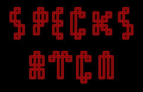

Typography L.O.V.E
Subscribe to:
Post Comments (Atom)


19 comments:
HELVETICA AS STANDARD BUT PALANTINO IS A PURE FONT FOR COPY.. DID YOU NO GILL SANS WAS A PIDO/PERVERT THAT SLEPT WITH HIS KIDS HAHAHAHA TRUE STORY
Gill Sans, what a fucker!
Comic sans makes me angry. It's like the person is trying to say 'i'm just mad, me' when actually they are called Malcolm and they live in Hull and their idea of fun is buying chicken kiev for tea, as a treat, like.
SPECKS specks SPECKS specks SPECKS
SPECKS specks SPECKS specks SPECKS
SPECKS specks SPECKS specks SPECKS
SPECKS specks SPECKS specks SPECKS
SPECKS specks SPECKS specks SPECKS
SPECKS specks SPECKS specks SPECKS
SPECKS specks SPECKS specks SPECKS
SPECKS specks SPECKS specks SPECKS
SPECKS specks SPECKS specks SPECKS
SPECKS specks SPECKS specks SPECKS
SPECKS specks SPECKS specks SPECKS
SPECKS specks SPECKS specks SPECKS
SPECKS specks SPECKS specks SPECKS
SPECKS specks SPECKS specks SPECKS
SPECKS specks SPECKS specks SPECKS
SPECKS specks SPECKS specks SPECKS
yeahisaidit- You are just one lol after another. And for once i'm not being ironic.
Mmmmmmm... typography.
I hate it when people only design with Helvetica makes me sick.
I love the elegance of Akkurat and quirkiness of Emigre
I made a fun typeface using the edges of paper for a brief that was set by the legendary DANIEL EATOCK.
Check it out here:
http://dels-superstitioustees.blogspot.com/2008/01/week-of-design-workshop.html
i might make a facebook group against comic sans, if there isn't one already.
WINGDINGS is the naked persons font! the font of the people (the naked people)
dels that is DOPE.
people should prepare to see some amazing stuff from you in the future.
specks...tres bon...& dels...yes, lets see more...
be well
Dels is a jack of all trades!
This is so geeky, but i love it!
Big up the Arial font crew
LOL
ok so, by coincidence i have just received what is possibly the most offensive email of my working life:
It's written in Comic Sans asking for my fax number.
whothefuckistillusingfaxmachines?
@ dels
lol helvetica is not my only choice its a standard font that is safe i could go on for hours about fonts there are that many, bastard is great by jonathan barnbrook but it depends on the design really.
Helvetica is the most beautiful font ever, however it's use don everything now and familiarity breeds contempt.
Big up DELS, nice work!
I'm having an affair with century gothic at the moment *shifty looks left-right* let's see how long it lasts
specks & dels are serious geeeeeeeeeeks! u make a perfect couple. i love u both... u make me smile.
i am next in line.
and naked.
Post a Comment